On being an artist

John Baldessari - Tips for Artists

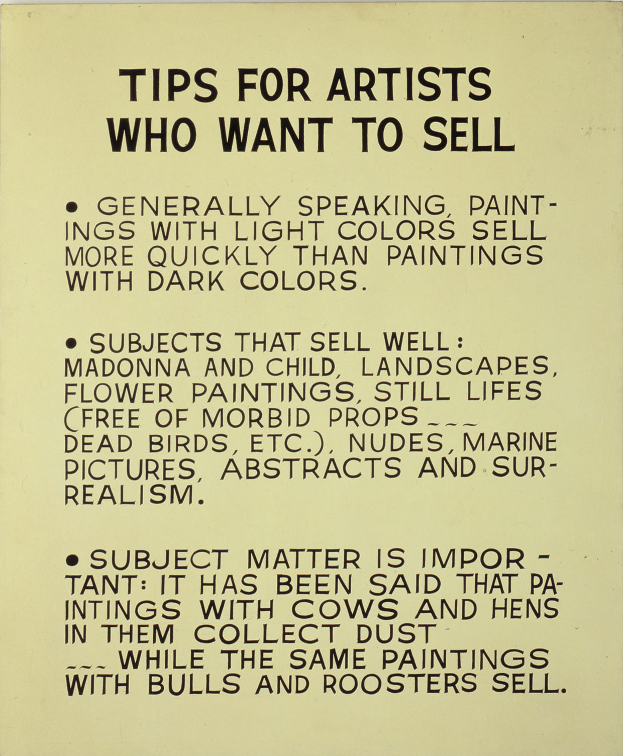
John Baldessari, Tips for Artists Who Want to Sell, 1966-1968

I’ve written about John Baldessari’s text paintings before but this seems like a good time to go back to one in particular: while I’m thinking about words of advice, Baldessari’s Tips for Artists Who Want to Sell seems like a good work to write about. There’s something pleasing – to me at least – about the idea of using the conventions of painting to produce something so unapologetically unpainterly. Lets face it, if Baldessari’s tips are even a little bit useful, by ignoring his own advice so comprehensively surely he’s ensuring his own work is unsaleable?

Except of course, he’s John Baldessari and as such he’s very far from whatever part of the art market it is that prefers paintings to be of landscapes, flowers or the madonna and child.

Continue reading

Party pieces

Bob and Roberta Smith, Join the Art Party, 2012

Bob and Roberta Smith knows how to make a point. In the exhibition The Art Party USA Comes to the UK at Hales Gallery at the moment (okay, not for much longer but there’s still a chance to catch the show if you’re quick), he’s in full-on soap box mode – he’s even made his own soap boxes for the occasion – in a bid to entice us to join the Art Party of the USA. The starting point for the Art Party was Bob and Roberta Smith’s May 2011 letter to Michael Gove, which he published to encourage others to write in to emphasise the importance of art in the school curriculum. Not a political party in any traditional sense, according to the website in order to join one simply needs to “make some art and encourage others to do so!”

Continue reading

False pretences

Maurizio Cattelan, Untitled (Denunzia), 1991

The idea of presenting an existing document as art – the essence of Keith Arnatt’s Notes from Jo – is something used in a very different way by Maurizio Cattelan. In this case the actual document is presented rather than a photograph; given that the document in question is a police report this seems like an important element of the work. This is a work that is all about the narrative it represents: in 1991, faced with not having produced the work for a forthcoming exhibition, Cattelan went to the police and reported the theft of an invisible artwork. He then presented the police report in the exhibition.

Continue reading

Signs of death

Nancy Holt, from Western Graveyards, 1968

In the series Western Graveyards, Nancy Holt is again recording individual elements from an existing sign system and representing them as an artwork. Here the playfulness of the California Sun Signs is replaced by a poignancy that comes from our encounter with people we never knew through a series of photographs of their last resting places and the way the lives have been memorialised. For me, the series is fascinating in several ways. Firstly, for a Londoner, especially in this summer of rain, the unfamiliarity of graves within a desert landscape is striking; the desolation of the location and the dilapidation of the graves seems at odds with the bright sunlight.

Continue reading

Signs of life

Nancy Holt, from California Sun Signs, 1972

The idea of representing existing text as art intrigues me and is something that can work in very different ways. It’s essentially the basis of Nancy Holt’s 1972 work California Sun Signs but this is a body of work driven by the inclusion of text in the image but in which the text is only a small part of the piece. Presented in a somewhat random but broadly circular arrangement on the wall, the individual images that make up California Sun Signs each show a sign found in the Californian landscape, which in each case includes the word sun.

Continue reading

Drawing on the familiar

Tracey Emin, I didn’t say I couldn’t love you, 2011

I’ll start by owning up to the fact that I wouldn’t have gone to see She Lay Down Deep Beneath the Sea, Tracey Emin’s exhibition at Turner Contemporary in Margate, if there hadn’t been a couple of other things on show outside the gallery that I particularly wanted to see. Over the years, Emin has made quite a lot of work I really like but most of it has been video and, with a few exceptions, I’m not crazy about her drawings, prints and paintings. But I was there so it would have been foolhardy not to take a look. I’ve seen enough of Emin’s work to know that at its best it can be genuinely affecting and that sometimes even the small, almost throw-away, drawings can be funny and occasionally hit a nerve or tell some sort of universal truth.

Continue reading

I wanted to love you more

Louise Bourgeois and Tracey Emin, Deep inside my heart, 2009-10

Artists collaborating is hardly unusual. And, as the last few posts have shown, artists copy what’s gone before on a regular basis. And occasionally they go so far as to take someone else’s work and change it, like the Chapman brothers did when making Insult to Injury or like Robert Rauschenberg did, albeit with Willem de Kooning’s permission, when he rubbed out a drawing to make Erased de Kooning (1953). When Tracey Emin worked on top of a series of paintings by Louise Bouregois, she did so at Bourgeois’s behest, the two artists having met some years earlier and been in regular contact since; though Bourgeois wasn’t generally interested in collaborations, the two artists had shared preoccupations giving the idea of a joint work a certain appeal. As a collaboration what perhaps made this unusual was that Emin had the paintings for more than a year before deciding how to proceed. Do Not Abandon Me, the series of prints made from these images, was to be one of Bourgeois’s last works; although Bourgeois saw Emin’s additions – and was delighted with them – the work was not shown until after her death.

Continue reading

The trouble with language

Fiona Banner, Every Word Unmade, 2007

Before moving on from text and language – at least temporarily, there’s more I want to write about at some point – it seems like a good idea to go back to the basic building blocks of text: letters and punctuation.  Typography is more usually the domain of designers but given that lots of artists have concerned themselves with language as a sign system, it’s no great surprise that some have also worked with its constituent parts.

In Every Word Unmade, Fiona Banner presents the alphabet as an opportunity for communication; the basic letterforms have the potential to become words.

Continue reading

Truth and the power of words

Jenny Holzer, Truisms, 1977-9 displayed at Times Square, 1982

For Jenny Holzer the work lies in the words rather than the particular way in which they are disseminated. So her Truisms have been projected in public spaces, worn as T-shirts, placed on gallery walls, plaques, stickers and postcards and more. The art lies in getting the words out there. Of course there are aesthetic and conceptual decisions about how and where they appear but it is the text and the way the audience encounters it that drives these.

Among the means of display Holzer employs, several involve sites or approaches more usually associated with advertising automatically colouring our response to the messages. Holzer’s slogans often challenge the political status quo in some way, making this appropriation of public display mechanisms all the more interesting.

Continue reading

The whole story

Fiona Banner, Apocalypse Now, 1997

Stories can be told in many different ways, words on the page and images on a cinema screen being two of the most common. It’s when the means of story-telling becomes words on a cinema screen that things start to get confusing. I’m not sure how easy it’d be to try to follow the story of Apocalypse Now from Banner’s piece of the same name, but the narrative is all there. It’s just that it’s there as a hand-written text on a page the size and shape of a cinema screen. And only yesterday there I was claiming Sean Landers choice of line length seemed excessive!

Continue reading