Looking back

Tate St Ives Summer 2013

Linder, Joining Valley, 2013

There’s a lot to enjoy in the summer exhibition at Tate St Ives, some of which I’ll quite likely write about later, but the work that really made me smile was one of Linder’s collages. I was already enjoying looking at this work and at the way the series of small collages shared a space with sculptures by Barbara Hepworth, but my enjoyment of Joining Valley wasn’t really about the work at all. It was one of those moments when something you haven’t thought about in years is suddenly brought back to mind by a chance encounter with an image on a gallery wall.

For me, Joining Valley is all about the kettle.

Continue reading

Pomp and ceremony

Peter Kennard, Maggie Regina, 1983

Peter Kennard, Maggie Regina, 1983

However one feels about Margaret Thatcher – and regular readers may by now suspect I’m not a fan – the ceremonial funeral seems like a contentious decision at the very least. Add to that the fact that it’s been discussed in the media as following the model of the funerals of Daina, Princess of Wales and the Queen Mother and it becomes easy to see Thatcher as receiving the royal status she seemed to award her self when she announced “we have become a grandmother.” Which, to my mind at least, makes this a good day to write about Maggie Regina, Peter Kennard’s 1983 depiction of Margaret Thatcher as Queen Victoria.

Continue reading

Gone

Gone with the Wind

Bob Light and John Houston, Gone With The Wind, 1982

Artists and designers reuse existing images all the time; think collage, think appropriation. And there’s a long tradition of photomontage as a way to make a political point with a powerful visual simplicity that I fully expect to write about further in a later post. IN reworking of the poster for Gone With The Wind for the Socialist Worker, Bob Light and John Houston brought together an iconic film poster (Reagan, after all, had a former career in Hollywood, albeit as very much a B movie actor; he was certainly no Clark Gable) with the politics of the 1980s with both humour and a serious intent.

Continue reading

And finally

Marcus Harvey, Margaret Thatcher, 2009

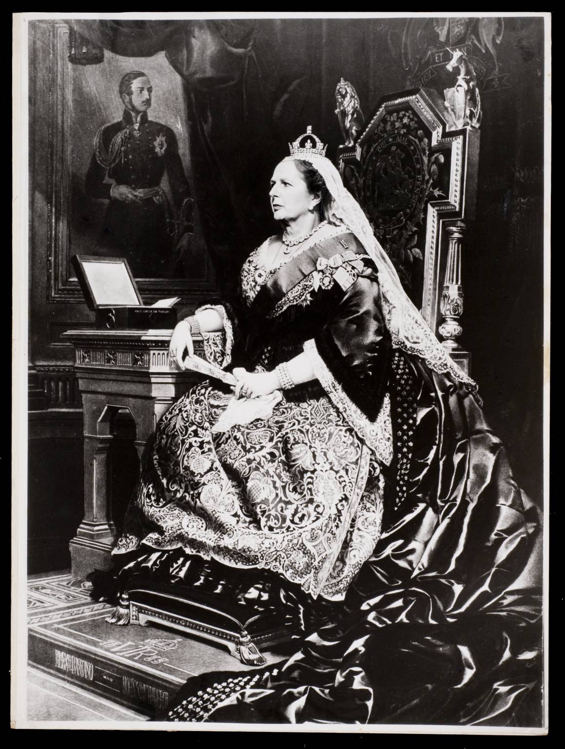
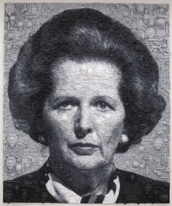
Marcus Harvey, Maggie, 2009

There are some days you think might never come. Frankly, recently, I was beginning to think that the day I got back to regular blogging might be one of them but I started today with a new determination. Then I got distracted and by the time I sat down to write I quite foray onto the interwebs provided me with both further distraction in the form of the the news that Margaret Thatcher is finally dead (for real this time, not just yet another Twitter rumour). To mark the occasion – and after the havoc she wreaked through my late teens and twenties, it does need to be marked (and yes, I’d be dusting off my copy of Spike: the Beloved Entertainer if only I had a record deck that worked) – it seems pertinent to write about Marcus Harvey’s Maggie.

Marcus Harvey is undoubtedly best known for another controversial portrait: Myra, a picture of Myra Hindley made using children’s handprints (well, prints from plaster cast hands), caused untold furore when it was shown at the Royal Academy in the Sensation exhibition. His painting Maggie, made nearly a decade and a half later, is rather less well known but equally striking. In my head at least, they are companion pieces: both large scale, black and white paintings made from images widely reproduced in the press and both – arguably, and here I concede there is a difference – portraits of, well, if not actually evil, then of women whose lives one would wish had followed a different path.

Continue reading

Fragmented view

John Stezaker, Untitled II, Reader from The Third Person Archive, 2012

There’s often something strangely frustrating about the Deutsche Börse Photography Prize and in some ways this year’s exhibition is no exception. Photography has been a dominant medium in art practice for a long time now but a prize of this nature has to balance art against documentary practices often resulting in a strangely unsatisfying exhibition. In this year’s exhibition, one body of work stands out in terms of he artist’s use of photography in his practice. Unusually for a Deutsche Börse nominee, John Stezaker (whose work I’ve briefly referred to before) uses rather than makes photographs, producing collages from found images gathered over several decades.

Continue reading

Art by post

Eugenio Dittborn, The 11th History of the Human Face (500 years) (Airmail painting no.91), 1990

For as long as there’s been an art world, art has travelled. In an increasingly international, multi-centre art world that’s truer than ever and artists working at an international level might have exhibitions in several countries at any one time. For some artists though getting their work out isn’t easy. For Eugenio Dittborn the question of how to get the work out has determined the nature of the work itself. Based in Santiago de Chile, for Dittborn the issue is not just about distance but about the problem of making art while living under a repressive regime and in 1984, with Chile governed by the military, he started to make what he calls Airmail Paintings. Collage-based works, these are made of lightweight, foldable materials and are posted to the galleries that exhibit them – often in segments to be assembled on arrival – with the envelopes becoming part of the work.

Continue reading

Half seen

Lucy Skaer, Leviathan Edge, 2009Lucy Skaer, Leviathan Edge part of the installation Thames and Hudson, 2009

Since I’m on a bit of a skull theme, Lucy Skaer’s Leviathan Edge – the skull of a sperm whale borrowed from National Museums Scotland for inclusion in her installation Thames and Hudson – popped into my mind. The skull is rather larger than those adorned by Damien Hirst or Gabriel Orozco. By about 14 foot or so. The whale skull is vast and its shape utterly unfamiliar. It’s a curious object made all the more fascinating by Skaer’s tantalising presentation of it in an enclosed space so that we can only see small sections of it through narrow slits.

Continue reading

Everyday art

Jeremy Deller, Open Bedroom, 1993 (reconstruction)

Like David Shrigley, Jeremy Deller is an artist whose work doesnt always fit easily into the gallery space. Unlike Shrigley though, when his work is brought together as an exhibiton it exceeds expectations. Joy in People at the Hayward Gallery is a show that is much more than the sum of its parts. And there are some pretty great parts.

In 1993, while others were holding open studios, Deller staged Open Bedroom, his first exhibition, in his parents’ house while they were on holiday. The work, his teenage bedroom presented as art, is reconstructed here as the route into both the show and the head of the artist. We get to open drawers and cupboards and explore the ideas, images and objects that fascinated the young Deller. It’s a great start and a useful grounding for a show that picks up these enthusiasms and makes them art.

Continue reading

Rubbish self-portraiture

Tim Noble and Sue Webster, Dirty White Trash (With Gulls), 1998 ( months’ worth of artists’ trash, 2 taxidermy seagulls, light projector)

Tim Noble and Sue Webster make rubbish self-portraits. That’s not to say they made self-portraits that are rubbish (though of course that’s a matter of opinion). No. It’s that they make self-portraits from rubbish. If we are what we eat – as the old cliché susggests – then surely we’re also defined in some way what we throw away.

The materials for Dirty White Trash (With Gulls) six months’ worth of artists’ trash. Noble and Webster have assembled the trash into a pile that casts a shadow of the couple sitting back to back, smoking and drinking as seagulls seem to pick at the pile of rubbish that forms the image.

Continue reading

Order and chaos

Kim Rugg, Ecstasy 7-7-7, 2008

For Kim Rugg, the chaos of a newspaper front page is something to be organised. I’m sure we’ve all seen publications we think could be better presented but few would go to Rugg’s lengths to create a different order out of the information on offer. Rugg painstakingly cuts up the page and reorganises the content according to her own system, so that here the letters in each section are in alphabetical order.

It’s easy to recognise the paper as the Guardian but harder to determine the news of the day and certainly impossible to make sense of it in any conventional way.

Continue reading