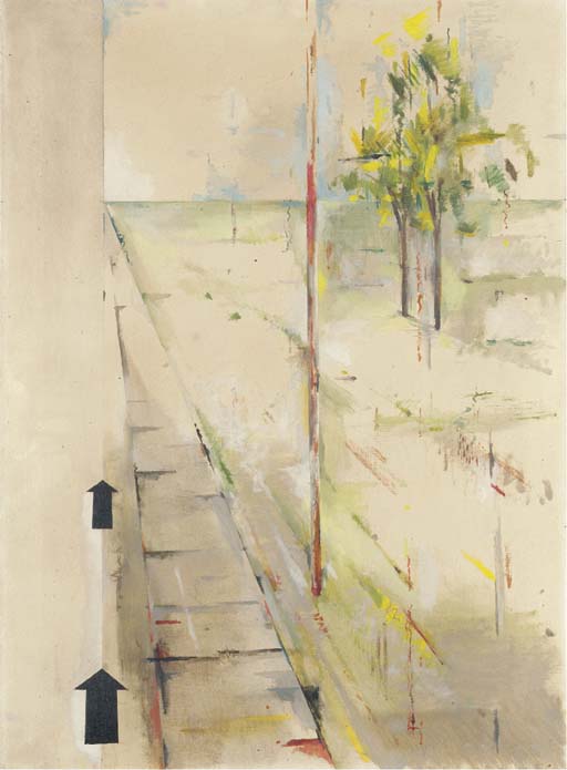
Richard Hamilton, Trainsition III, 1954
I often think my journey to work is a bit ridiculous. Like many people teaching in art colleges, I live in London but work elsewhere. On a good day* my commute is a four and a half hour round trip, give or take a bit. Though there is art in other cities – a lot in some places, but then Glasgow would be an even stupider commute for me – for me, being in London makes the most sense. (Plus, you know, I’m a Londoner. Always have been and probably always will be.) It’s just that I don’t happen to work here.
Like many of my colleagues, I accumulate piles of train tickets. Many of us seem to have vague plans to make a piece of work with them at some point. Whether anyone ever will, I don’t know (I’ve yet to see the evidence if they have). I know I haven’t (and, in all honesty, probably never will).
All of which means that there was one series of works in the Richard Hamilton exhibition at Tate Modern that really resonated: the Trainsition paintings. Hamilton taught at Newcastle for years but, it seems, stayed living in London. Suddenly my commute seems positively mundane. Unlike me though, Hamilton turned the experience into art. Well done that man.


 1970")


 1990")

