
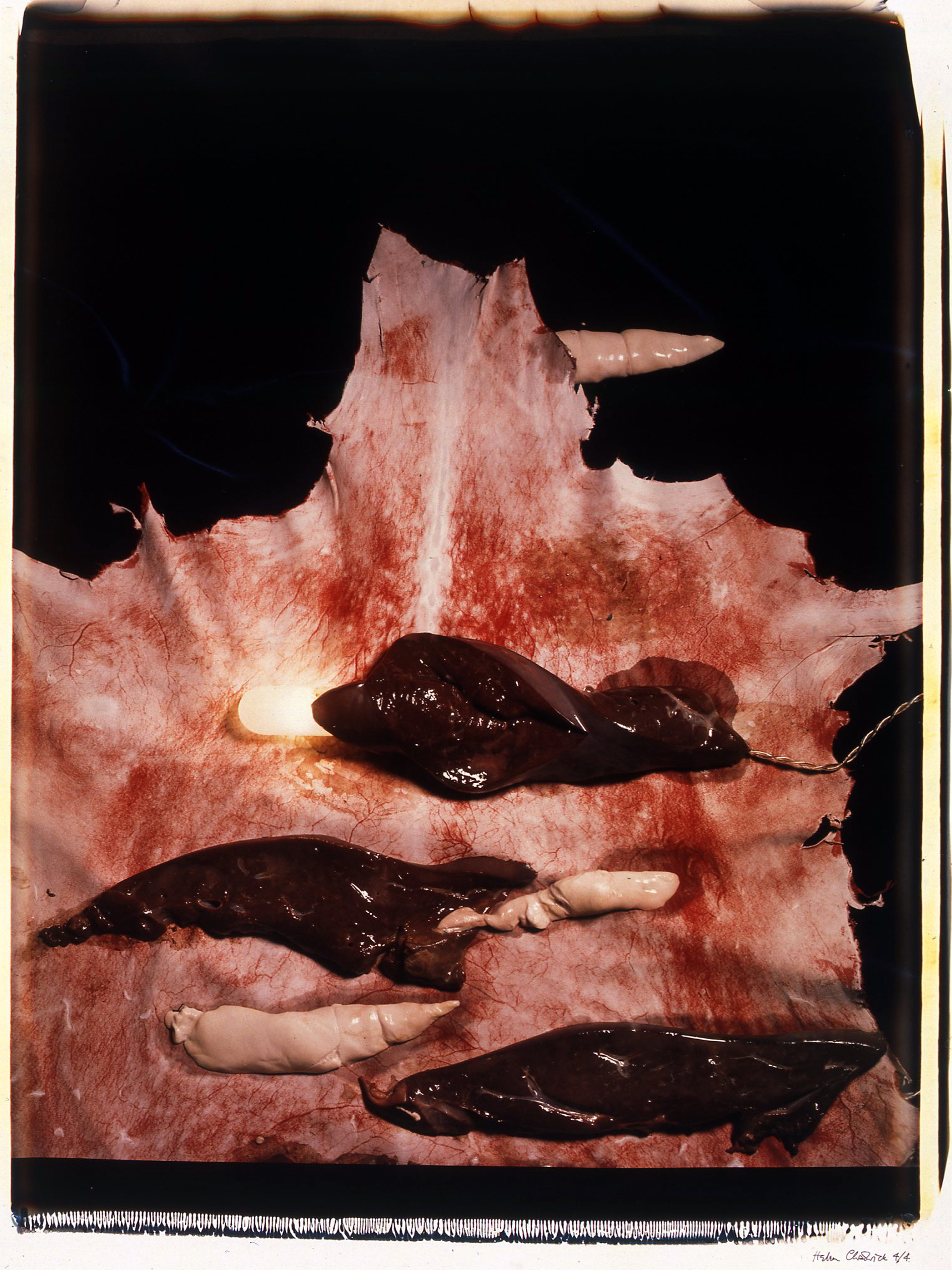
Cathy de Monchaux, Dangerous Fragility, 1994
One of the things that really struck me looking at Alex Van Gelder’s Meat Portraits was that they reminded me of a very different body of work: Cathy de Monchaux’s small-scale sculptures made from materials velvet, leather and metal. Searching for the works that come most immediately to mind proves tricky; images of the works I remember best from de Monchaux’s Whitechapel exhibition or from the Turner Prize show the year she was nominated prove elusive but the seductive beauty of the lush red velvet held in oddly fleshy formations by brass fittings has stayed with me.
The pale pink leather of works like Dangerous Fragility is in come ways more bodily – clearly evoking skin – but it’s the combination of the softness of the velvet and its wound like appearance that I find particularly fascinating.


