Page after Page

Ceal Floyer, Facsimile, 2011

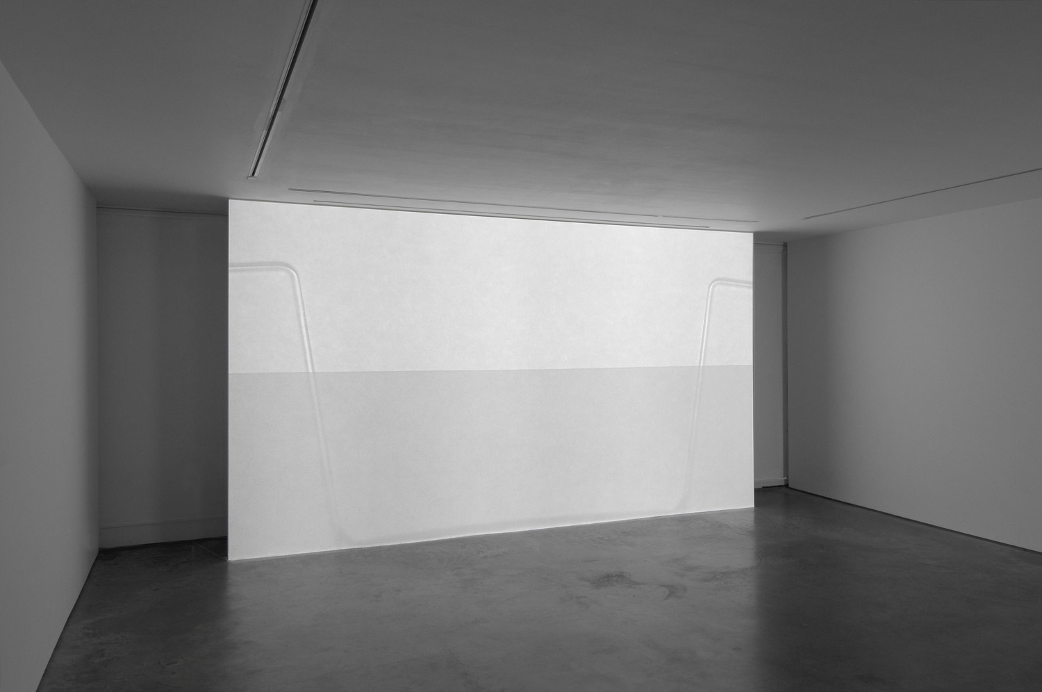
Ceal Floyer, Facsimile, 2010

What made me start thinking about Ceal Floyer’s work was the idea of emptiness and of the work making the whiteness of the space. And in that respect the work that came to mind was from an exhibition I saw at the Lisson Gallery rather longer ago that I first thought. It seems on the whole improbable that it’s three and a half years since I saw Facsimile – though the evidence is unambiguous – given that it remains very clear in my head. The projection – almost completely white – fills the wall. It takes a while to get the significance the slight trace of movement that constitutes the image: the video is of a fax machine; the paper being passed through it seemingly blank. If the fax is sending rather than receiving a message, there could of course be all manner of important information on the other side of the page but there is no visible trace so it reads as a transmission of emptiness. In the days when fax machines were commonplace – and I don’t know about you but it must be years since I’d sent a fax even in 2010 when Floyer made the work – it seems entirely possible that I regularly got confused about which way up to put the paper and send page after page of nothingness to confused (non) recipients but the deliberate whiteness of Floyer’s Facsimile is intriguing. I find myself enjoying the emptiness rather than wondering what message I might be missing.

Continue reading

Drawing on the past

Turk Frottage 2009

Gavin Turk, Frottage, 2009

Though he’s made a pretty wide range of work in between, I was interested to find that my altogether half-arsed research for the previous post threw up an image of a recent work I didn’t know and whose existence surprised me. Frottage, made in 2009, close to two decades after Cave, is a rubbing of that same blue plaque. I’m guessing of course (yes, yes, I know, research is good but sometimes the path of least resistance is just so much more appealing) but I rather suspect this is a work made in order to use the title and the amusement to be gained from using a term that is technically correct in art terms but which also has sexual connotations. And why not?

Continue reading

Marking territory

Gavin Turk, Cave, 1991 (installed at the RCA)

Gavin Turk, Cave, 1991 (installed at the RCA)

The oblique reference to cave painting in the title of that last point was entirely to allow me to segue somewhat untidily from wall drawings to Gavin Turk’s Cave, an English Heritage style blue plaque that formed his degree show when he finished at the Royal College of Art in 1991. The show essentially consisted of an empty studio with a sign declaring that ‘Gavin Turk, sculptor, worked here 1989–1991’.

Continue reading

Skeletal geometries

LeWitt Five Open Geometric Structures 1979

Sol LeWitt, Five Open Geometric Structures, 1979

Thinking about the blurring of the boundary between sculpture and drawing brings Sol LeWitt to mind; add a fascination with geometry into the mix and I find myself looking afresh at LeWitt’s Open Geometric Structures in particular. There’s a beautiful simplicity to the structures – a term LeWitt favoured over sculptures – with the openness lending them a feeling of being drawings in space rather than, or as well as, being objects.

Continue reading

Drawing in waves

Gabriel Orozco, Dark Wave, 2006

Gabriel Orozco, Dark Wave, 2006

Is it a bird? Is it a plane? No, it’s a sculpture. Or is it a drawing? It’s so hard to tell sometimes. Gabriel Orozco’s Dark Wave is a replica of a whale skeleton – so, clearly sculpture – on which a pattern has been drawn – a drawing then – it’s all so confusing. Quite apart from the overwhelming scale of the piece, what I like about this work is the ambiguity of the thing. There’s the starting point of it feeling like a readymade that’s been worked – an approach Orozco has used a lot in works like La DS – on but in fact the skeleton is remade resin and calcium carbonate before being draw on in graphite. Then there’s the way the pattern makes it harder to quite figure out the skeleton but still somehow manages to feel like it’s meant to be there, albeit in a way that makes the piece feel like it might be some sort of archaeological find.

Continue reading

Precisely drawn confusion

Susan Collis, Conchi, 2008

Susan Collis, Conchi, 2008

Even knowing about Collis’s transformations of ordinary objects, there’s something surprising about her works that mimic laundry bags. These aren’t readymades subtly transformed by the inlaying of jewels; they’re even less what they seem to be at first glance. Rather than woven plastic, the bags are made of paper – okay for thoroughly dry laundry, but run out of coins in the laundrette and there’s a chance your bag could collapse on the way home – and their woven appearance is just that: an appearance. A very carefully drawn on one.

Continue reading

Tread carefully

Susan Collis, The Oyster's Our World, 2004

Susan Collis, The Oyster’s Our World, 2004

A stepladder. Every gallery should have one, of course. And every studio. And, come to that, every home. So what makes a stepladder worth writing about? Well, of course, you can analyse anything really if you set your mind to it. In the case of this stepladder, the signs are there. The traces of paint suggest it’s reasonably well used but it’s not completely covered in paint the way it would be if constantly in use for decorating. As a gallery step ladder, the odd bit of white paint is to be expected but it’s quite likely that it’s often in use for hanging work so a bit painty but not too painty makes perfect sense.

But why wouldn’t the gallery clear the ladder away when it’s not in use? That’s the question. And of course, it’s a question that makes it worth taking a closer look.

Continue reading

Bodily forms

Cathy de Monchaux, Dangerous Fragility, 1994

Cathy de Monchaux, Dangerous Fragility, 1994

One of the things that really struck me looking at Alex Van Gelder’s Meat Portraits was that they reminded me of a very different body of work: Cathy de Monchaux’s small-scale sculptures made from materials velvet, leather and metal. Searching for the works that come most immediately to mind proves tricky; images of the works I remember best from de Monchaux’s Whitechapel exhibition or from the Turner Prize show the year she was nominated prove elusive but the seductive beauty of the lush red velvet held in oddly fleshy formations by brass fittings has stayed with me.

The pale pink leather of works like Dangerous Fragility is in come ways more bodily – clearly evoking skin – but it’s the combination of the softness of the velvet and its wound like appearance that I find particularly fascinating.

Continue reading

Floating islands

Yutaka Sone Venezia 2013

Yutaka Sone, Venezia, 2013

Though I’d seen Yutaka Sone’s work before and found it fascinating, the work in his show at David Zwirner interested me more not just for the extraordinary accuracy of the marble cityscapes but for the places they represent. I think the only carved marble work by Sone I’d seen in real life before is Highway Junction 105-110 which depict freeway intersections in Los Angeles, a city I’ve never visited and only really know from films. The works felt a bit like architectural models, albeit it unexpectedly made of white marble. Here the cities are Venice, New York and Hong Kong. Admittedly I’ve only been to Hong Kong once, very briefly and a long time ago but the other two are cities I know well.

Sone has mapped the territory in incredible detail using methods as diverse as aerial surveillance and Google earth to gain as exact an understanding of the cityscape as possible before it is carved by hand into the marble.

Continue reading

Picnic at hanging rock

 Fischei Weiss, Rock on Top of Another Rock, London 2013

 Fischei Weiss, Rock on Top of Another Rock, Serpentine Gallery, London 2013

I’ve written about Rock on Top of Another Rock before but at the time I entirely failed to get round to the follow-up post about its London incarnation so I’m quite pleased to find myself back with it now by a somewhat circuitous route. A recent visit – on a rainy winter afternoon – reminded me quite how much I like the way this work pairs a simple idea with a complex and audacious challenge in terms of sourcing the materials and installing the work. The Ronseal nature of the title imparts a sense of playfulness to what is also in some ways quite a scary piece of sculpture. It’s all a matter of balance.

Continue reading