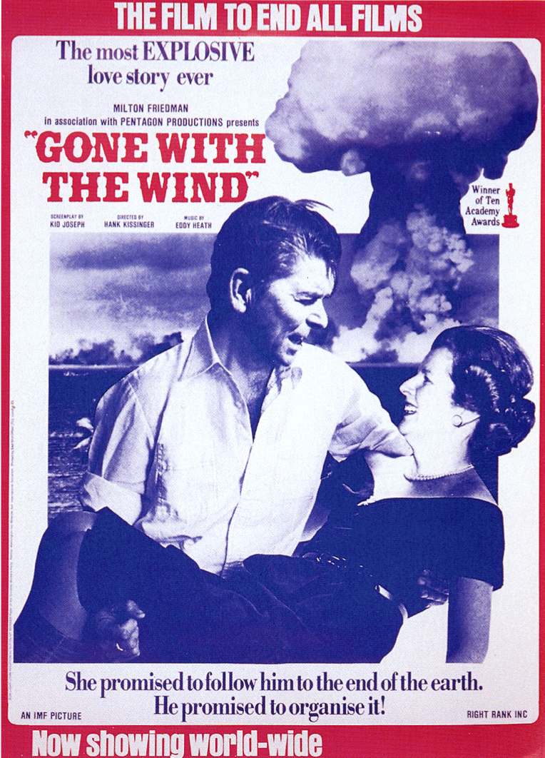
Bob Light and John Houston, Gone With The Wind, 1982
Artists and designers reuse existing images all the time; think collage, think appropriation. And there’s a long tradition of photomontage as a way to make a political point with a powerful visual simplicity that I fully expect to write about further in a later post. IN reworking of the poster for Gone With The Wind for the Socialist Worker, Bob Light and John Houston brought together an iconic film poster (Reagan, after all, had a former career in Hollywood, albeit as very much a B movie actor; he was certainly no Clark Gable) with the politics of the 1980s with both humour and a serious intent.

Much was made of the so-called special relationship between Britain and the United States in the Thatcher/Reagan era and in 1982 the threat of nuclear weapons being used seemed an ever-present one and the arguments about their siting on British soil the subject of countless CND protests.
Though made for the Socialist Worker – Houston was the paper’s art editor, Light a docker who approached him with the idea – the image reached a rather wider audience when distributed in poster and postcard form. (There may also have been mugs, but it seems entirely possible I imagined those.) The humour, in the tradition of political image-making, is simple and straight-forward but the nature of a film poster is that, as well as an image, there is text to be reworked and names to be changed to identify the guilty.

I had that poster on my bedroom wall for…ooh…years…
I’m a bit envious of that! I had a postcard but have no idea what became of it.
I remember that cut and paste parody style being very popular among left-wing art eds in the 80s. I can’t remember the name of the art ed for City Limits (David ?), but his work was everywhere: lots of big black Impact font and witty collage.
I still have that postcard, or the “Market Forces sweetheart” one.
I loved the political art of the 1980s.
check out Gee Voucher and Crass for some serious 80’s artwork