Cave painting

Richard Wright, Untitled, 2009 (Tate Britain, Turner Prize Exhibition)

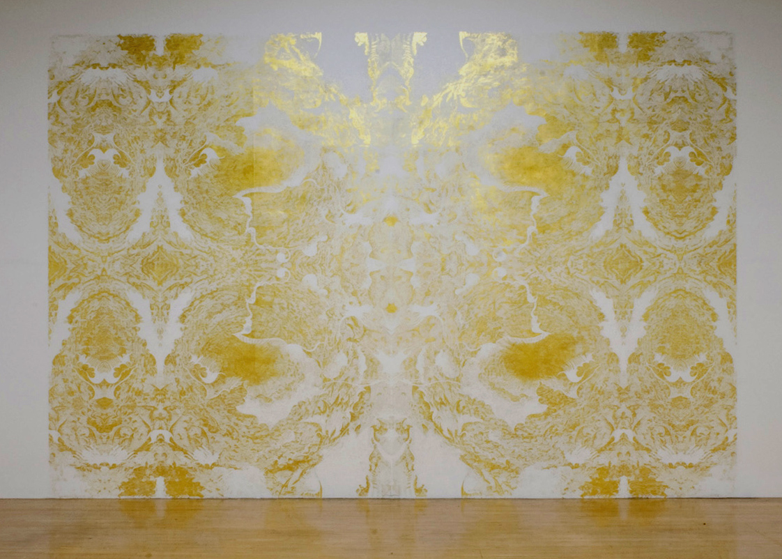
Richard Wright, Untitled, 2009 (Turner Prize exhibition, Tate Britain)

For all that I’m fascinated by Sol Lewitt’s conceptual approach, his wall drawings also bring the extraordinary beauty of Richard Wright’s wall paintings to mind and bring me back to work that can be enjoyed on a purely aesthetic basis. That’s not to say that there are no ideas in play here but faced with a work like the one Wright made for the 2009 Turner Prize exhibition my first reaction is one of wonder at both the extravagant beauty and the scale of the thing.

Continue reading

Just following instructions


Sol LeWitt wall drawing being made at Dia Beacon

Sol LeWitt wall drawing being made at Dia Beacon

Drawing on a big scale – and some of Sol LeWitt’s larger wall drawings are on a very big scale, more installation than drawing really – can be quite an undertaking. Even if LeWitt had made most of his work himself he could have been forgiven for bringing in a team of assistants to help out. Given his strategy of generating instructions for others to follow though the process of drawing is, by definition, the domain of hired hands.

Continue reading

Skeletal geometries

LeWitt Five Open Geometric Structures 1979

Sol LeWitt, Five Open Geometric Structures, 1979

Thinking about the blurring of the boundary between sculpture and drawing brings Sol LeWitt to mind; add a fascination with geometry into the mix and I find myself looking afresh at LeWitt’s Open Geometric Structures in particular. There’s a beautiful simplicity to the structures – a term LeWitt favoured over sculptures – with the openness lending them a feeling of being drawings in space rather than, or as well as, being objects.

Continue reading

Drawing in waves

Gabriel Orozco, Dark Wave, 2006

Gabriel Orozco, Dark Wave, 2006

Is it a bird? Is it a plane? No, it’s a sculpture. Or is it a drawing? It’s so hard to tell sometimes. Gabriel Orozco’s Dark Wave is a replica of a whale skeleton – so, clearly sculpture – on which a pattern has been drawn – a drawing then – it’s all so confusing. Quite apart from the overwhelming scale of the piece, what I like about this work is the ambiguity of the thing. There’s the starting point of it feeling like a readymade that’s been worked – an approach Orozco has used a lot in works like La DS – on but in fact the skeleton is remade resin and calcium carbonate before being draw on in graphite. Then there’s the way the pattern makes it harder to quite figure out the skeleton but still somehow manages to feel like it’s meant to be there, albeit in a way that makes the piece feel like it might be some sort of archaeological find.

Continue reading

Precisely drawn confusion

Susan Collis, Conchi, 2008

Susan Collis, Conchi, 2008

Even knowing about Collis’s transformations of ordinary objects, there’s something surprising about her works that mimic laundry bags. These aren’t readymades subtly transformed by the inlaying of jewels; they’re even less what they seem to be at first glance. Rather than woven plastic, the bags are made of paper – okay for thoroughly dry laundry, but run out of coins in the laundrette and there’s a chance your bag could collapse on the way home – and their woven appearance is just that: an appearance. A very carefully drawn on one.

Continue reading

Tread carefully

Susan Collis, The Oyster's Our World, 2004

Susan Collis, The Oyster’s Our World, 2004

A stepladder. Every gallery should have one, of course. And every studio. And, come to that, every home. So what makes a stepladder worth writing about? Well, of course, you can analyse anything really if you set your mind to it. In the case of this stepladder, the signs are there. The traces of paint suggest it’s reasonably well used but it’s not completely covered in paint the way it would be if constantly in use for decorating. As a gallery step ladder, the odd bit of white paint is to be expected but it’s quite likely that it’s often in use for hanging work so a bit painty but not too painty makes perfect sense.

But why wouldn’t the gallery clear the ladder away when it’s not in use? That’s the question. And of course, it’s a question that makes it worth taking a closer look.

Continue reading

Bodily forms

Cathy de Monchaux, Dangerous Fragility, 1994

Cathy de Monchaux, Dangerous Fragility, 1994

One of the things that really struck me looking at Alex Van Gelder’s Meat Portraits was that they reminded me of a very different body of work: Cathy de Monchaux’s small-scale sculptures made from materials velvet, leather and metal. Searching for the works that come most immediately to mind proves tricky; images of the works I remember best from de Monchaux’s Whitechapel exhibition or from the Turner Prize show the year she was nominated prove elusive but the seductive beauty of the lush red velvet held in oddly fleshy formations by brass fittings has stayed with me.

The pale pink leather of works like Dangerous Fragility is in come ways more bodily – clearly evoking skin – but it’s the combination of the softness of the velvet and its wound like appearance that I find particularly fascinating.

Continue reading

Meat illuminated: Helen Chadwick’s Meat Abstracts

Helen Chadwick, Meat Abstract #3, 1989

Helen Chadwick, Meat Abstract #1, 1989

Alex Van Gelders Meat Portraits brought a couple of other bodies of work to mind for me so, ever in pursuit of an overly obvious link, it seems like a good chance to think about Helen Chadwick’s beautiful but disgusting Meat Abstracts. The extraordinary quality of these pictures really doesn’t come across in reproduction but even so the lushness of the pictures is apparent.

The pictures  are very deliberately put together; with props and fabrics lending an air of  sumptuous theatricality. In each, a careful arrangement of meat has been laid out; each is  lit in part from the single light build positioned within the frame.

Continue reading

Animal magic: Alex Van Gelder’s Meat Portraits

Alex Van Gelder, Meat Portraits #13, 2012

Alex Van Gelder, Meat Portraits #13, 2012

I’ll admit to approaching the exhibition of Alex Van Gelder’s Meat Portraits at Hauser and Wirth with a feeling of trepidation. Yes, from what I’d seen the images looked rather beautiful, but there’s no getting round the fact that they’re photographs of bits of dead animal and I’m a vegetarian so meat isn’t something I’m keen on looking at really.

Individually, many of the images are undeniably beautiful to the extent it’s sometimes hard to remember that the subject matter is so gruesome. The colours and patterns are seductive and there’s a pleasing symmetry to some of the pictures that just doesn’t say abattoir to me. At times it’s all too clear though.

Continue reading

Fear of the blank page

Martin Creed, Work No 88, 1995

Martin Creed, Work No. 88, A sheet of A4 paper crumpled into a ball, 1995

There’s something about a blank page. There’s a sense of possibility, of course: this could be where it all goes right – this page could soon be home to the perfect drawing or piece of text – but there’s also a sense of anxiety, after all what can go very right can also go very wrong. We’ve probably all been there, stuck in the cycle that sees each new page end up in the bin. You write. You read. You screw up the page and start again. If the blank page carries a sense of possibility I guess the scrunched up ball of paper carries the sense of exasperation.

In the case of Martin Creed’s Work No. 88, A sheet of A4 paper crumpled into a ball the connotation of disappointment at things not going according to plan is there to an extent but the tight roundness of the resulting ball is too close to perfect to be the result of anything other than a more careful, considered crumpling up of the page.

Continue reading