Smoke and mirrors

Olafur Eliasson, The Weather Project, 2003Olafur Eliasson, The Weather Project, 2003 (Turbine Hall, Tate Modern)

Mirrors can make a room look bigger. We all know that. They can also make a space confusing. We all know that too. At some stage, most of us have probably been in a public place with a mirrored wall and though the room extended further than it actually did. We may even have walked into the mirror by accident. These things happen.

The idea of a mirrored ceiling is a strange one. On the one, hand it’s an idea with somewhat seedy connotations. On the other hand, it can double the height of a room; okay, so it can only seem to do that, but you know what I mean. It’s this, somewhat disorientating, effect that Olafur Eliasson was going for when he installed a false ceiling in the Turbine Hall of Tate Modern as part of his 2003 installation The Weather Project. In the event, it both messed with our perception of the height of the space and made people behave in a way that they usually don’t in an art museum.

Continue reading

Upside down

Richard Wilson, 20:50, 1987 (Matt’s Gallery, Martello Street, London)

Art can make us see the world differently. Certainly the way both Gordon Matta-Clark and Richard Wilson have cut away sections of buildings challenges our perception of architecture making us see city spaces differenttly in a literal but nonethheless interesting way.

Wilson’s iinstallation 20:50, a room with a seemingly mirrored surface at roughly waist height, offers a strangely new understanding of the space it’s installed in. For the unsuspecting visitor, the first clue about the nature of the surface is the smell, approaching the room one is greeted with a powerful aroma of oil. Suddenly the  title – 20:50 – makes sense: the room is flooded with used engine oil. A walkway leads out into the middle of the space, from which you get to see the features of the room reflected all around you.

Continue reading

Inside out

20120522-085354.jpg

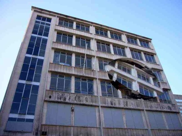
Richard Wilson, Turning the Place Over, 2007

Quite high on the list of art I wish I’d seen is Richard Wilson’s installation for the 2007 Liverpool Biennial. Like other works by Wilson, who is probably best known for his installation 20:50 at the Saatchi Gallery (about which more another time, possibly even tomorrow now that it’s in my head), Turning the Place Over was an architectural intervention on an ambitious scale but unlike 20:50 this was a temporary installation made by messing with the fabric of an empty building.

Continue reading

Dividing the space

Gordon Matta-Clark, Splitting, 1974

One of my main preoccupations over the last couple of weeks while preparing for the end of year exhibition is how to divide up the space. Obviously for me this involves figuring out where the walls should go and what should go where to make the exhibition make as much sense as possible. But, you know, a bit of literal mindedness and it’s only a small leap from how to divide the studio to Gordon Matta-Clark and the chainsaw and sledgehammer approach to redefining architectural space.

The 1970s may have a lot to answer for in all sorts of ways, but some pretty ground-breaking – or in Matta-Clark’s case building-breaking – art was made then and it’s work that still resonates and that continues to influence subsequent generations of artists.

Continue reading

A perfect match

Vija Celmins, To Fix the Image in Memory I-XII (detail), 1977-82

Vija Celmins, who also makes extraordinary prints and drawings of the night sky, oceans and spiders’ webs which I’m sure I’ll write about at some point, has taken the idea of the copy to an almost neurotic extreme. To Fix the Image in Memory is a collection of stones each with its own identical twin in the form of a painted bronze copy.

Displayed together it’s difficult – okay, pretty much impossible – to tell which is which.

Continue reading

Making good the gallery space

Susan Collis, Don’t Get Your Hopes Up, 2007

As the end of the academic year approaches, the time has come to turn a very messy art school studio into as good an approximation of a white cube gallery space as possible. I love the process of making the end of year exhibition but I’m not so keen on the construction part of it. All that filling, sanding, cleaning and painting is stupidly tiring – even for me, and frankly I mostly direct proceedings while others to the actual work – and pretty stressful. We always get it done but there’s always a point where it seems like we won’t. Which brings my thoughts to work that reminds me of the tools we need and the work that needs doing.

Susan Collis’s work fits the bill perfectly. After all, her exhibition Don’t Get Your Hopes was basically a gallery in need of some art, right? Well, appearances can be deceptive.

Continue reading

Conversations with history

Christine Borland, Family Conversation Piece, 1998

The skull is a powerful symbol. While others have used real skulls as the basis for drawing, sculpture or installation, Christine Borland has used skulls as a starting point for making works in other materials. The skulls in Christine Borland’s Family Conversation Piece are made from fine bone china which is then traditionally decorated in blue and white. The work was originally made for an exhibition at Tate Liverpool, so the choice of bone china was a deliberate one intended to resonate with Liverpool’s history as a producer of china with the decoration – in the style of the porcelain made in Liverpool in the eighteenth century – also referencing the city’s history as a trading port involved in the shipping of both produce and slaves.

Continue reading

Half seen

Lucy Skaer, Leviathan Edge, 2009Lucy Skaer, Leviathan Edge part of the installation Thames and Hudson, 2009

Since I’m on a bit of a skull theme, Lucy Skaer’s Leviathan Edge – the skull of a sperm whale borrowed from National Museums Scotland for inclusion in her installation Thames and Hudson – popped into my mind. The skull is rather larger than those adorned by Damien Hirst or Gabriel Orozco. By about 14 foot or so. The whale skull is vast and its shape utterly unfamiliar. It’s a curious object made all the more fascinating by Skaer’s tantalising presentation of it in an enclosed space so that we can only see small sections of it through narrow slits.

Continue reading

Right there in black and white

Gabriel Orozco, Black Kites, 1997

For the Love of God, Damien Hirst’s diamond encrusted skull, got me thinking about another – and in my view much more interesting – human skull that has become contemporary art. Gabriel Orozco’s Black Kites is an extraordinary three-dimensional drawing on a distinctly less than conventional ground. This is a work I found both moving and compelling.

Continue reading

Art bling

Damien Hirst, For the Love of God, 2007

The Damien Hirst exhibition at Tate Modern offers both a welcome(ish) chance to revisit Hirst’s early work and be reminded that he did start out by making some genuinely challenging and interesting work and a less welcome opportunity to see some of the most extreme art bling one is ever likely to encounter. Most obviously, there’s that skull. For the Love of God has generated so much press it’s not really possible to be all that surprised by it. Nonetheless, it’s a strange experience.

Continue reading